
GiftBetter: Visualizing a new marketplace for discovering and supporting local businesses
How we developed an explanatory brand identity for a category-first e-commerce platform.
Challenge
Support local businesses and look super thoughtful and in-the-know? GiftBetter sounded great, once you read the 40-bullet executive summary or watched the 2-minute “teaser” video. But how do you get a scrolling consumer or corporate HR rep to understand the concept and get the appeal in seconds?
Insight
Less than 10 percent of annual gift card spend goes to local merchants. Keeping more of that cash in our communities practically benefits local merchants and reputationally benefits corporate HQs and casual gifters.
Solution
A visual identity that cleanly, succinctly, and cleverly links gift-giving and geography.
Is there a universal symbol for gifting? What about place? And can they cleanly combine? This project started with a sea of icons: giftbags, envelopes, confetti, flags, tri-fold maps… until finally, we landed on a shape so versatile that we couldn’t stop making things with it.
A balloon.
An emblem of celebration, the balloon leant itself perfectly to little moments of celebration and recognition — and conveniently doubles as a map pin.
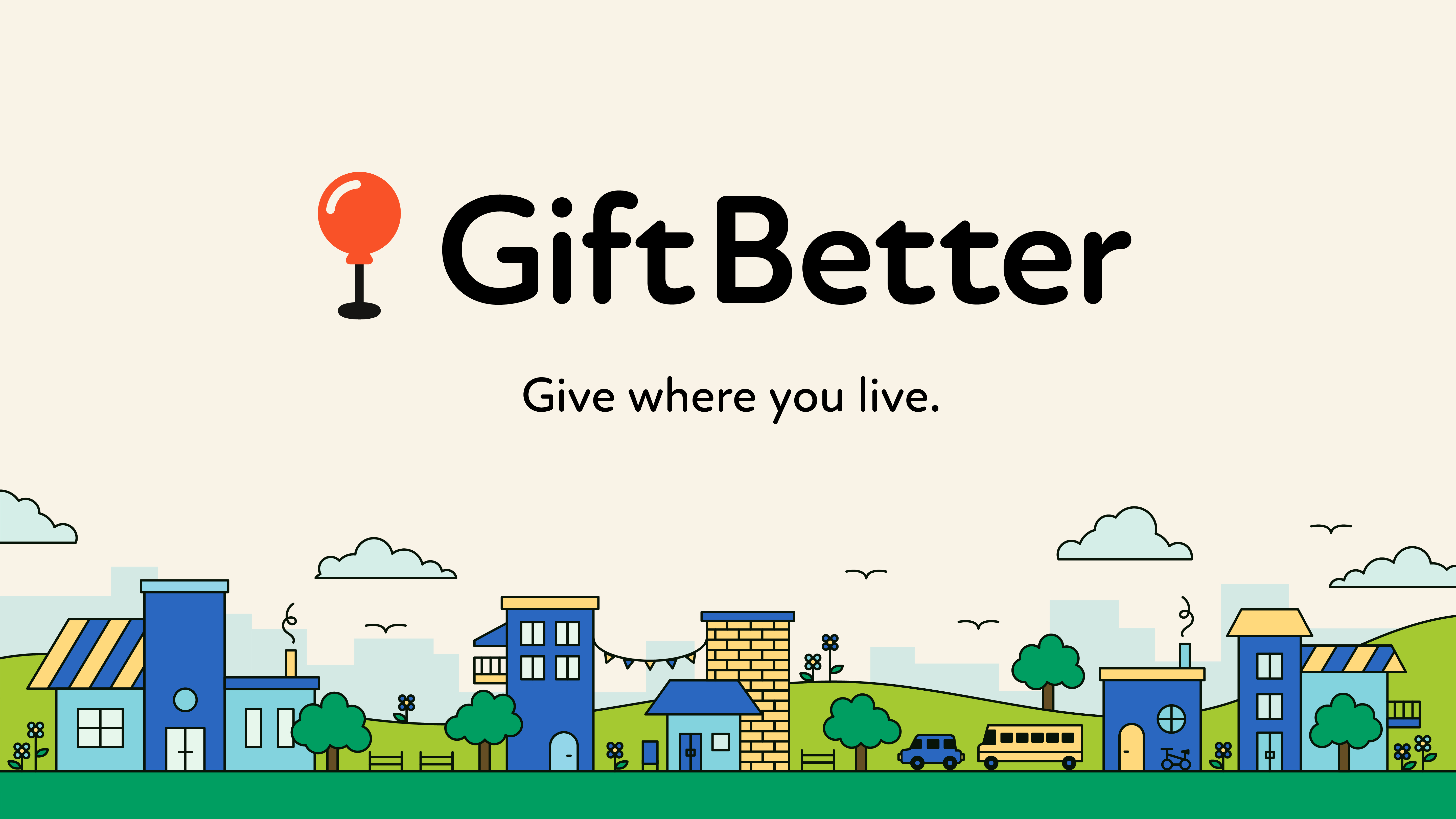
From “Nowhere Place” to “Everywhere Street”
Once we landed on our primary icon, we built an illustration system designed to represent urban density, historic business districts, and local ownership. This “Everywhere Street” is an intentional foil to the kinds of “Nowhere Places” that have invaded and replaced small towns and Main Streets across the country. Architectural detail, charm, and mixed use abound in place of indistinguishable gray-boxed utility and surface parking. (This is not a Target.)
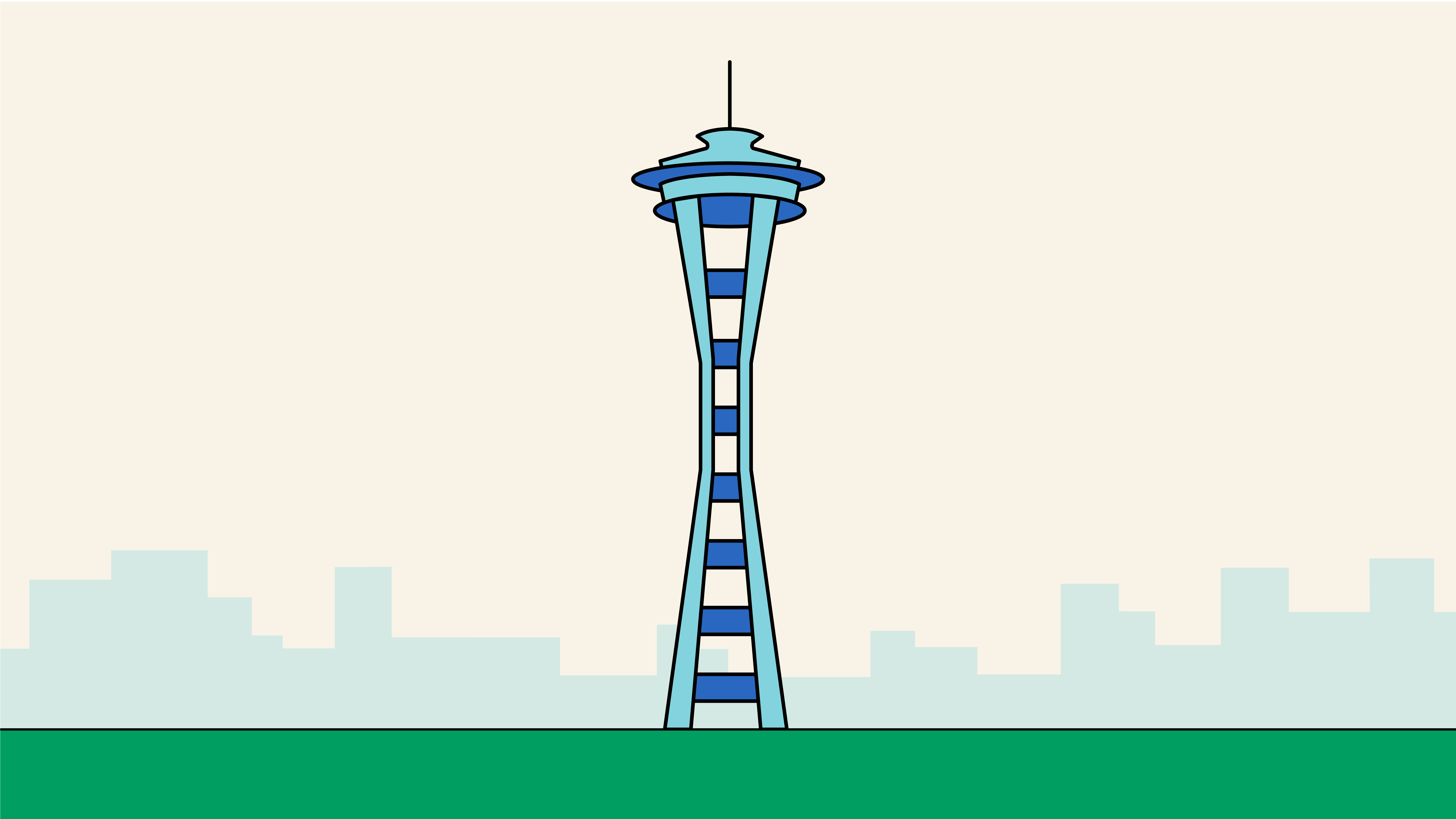
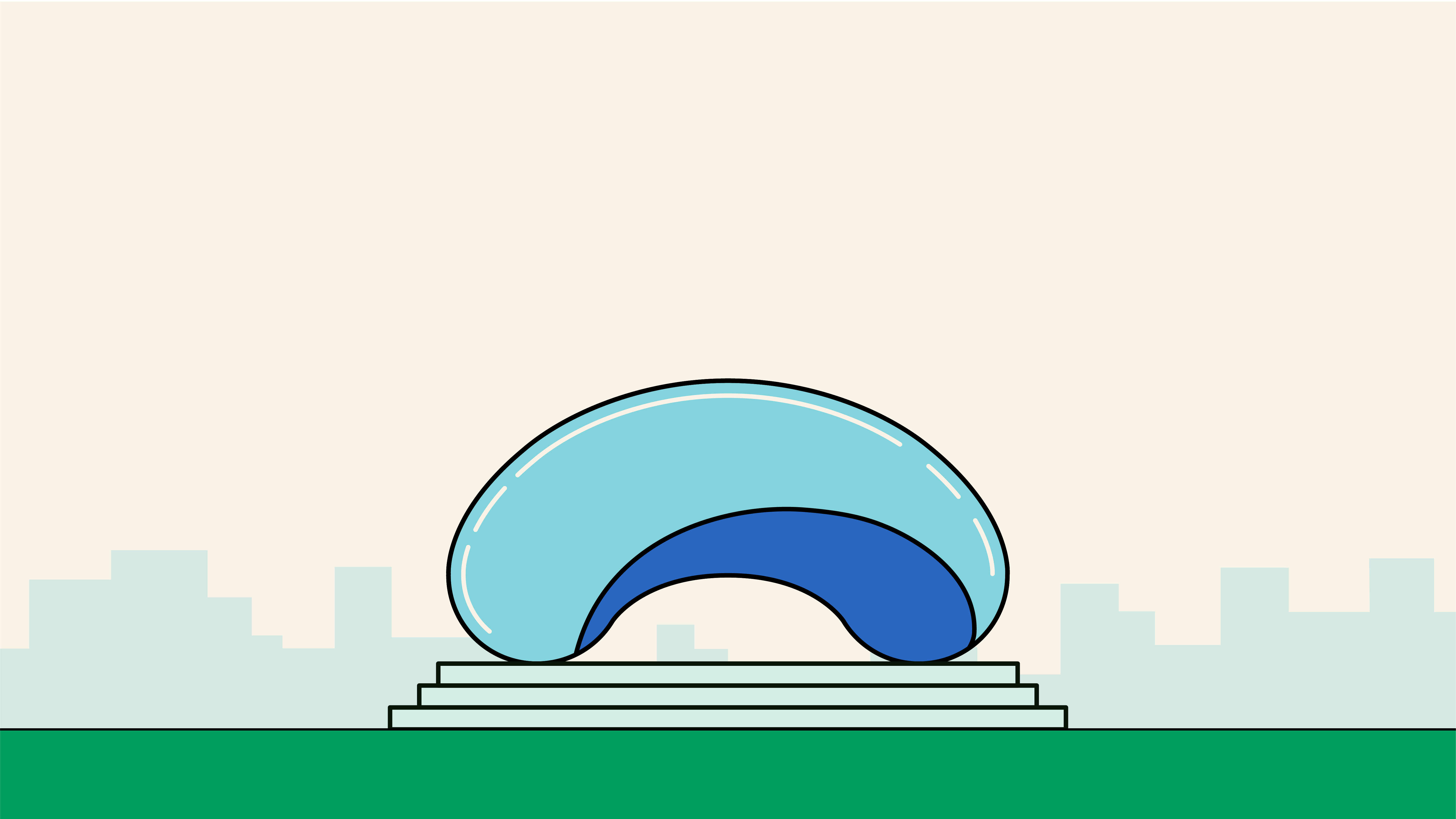
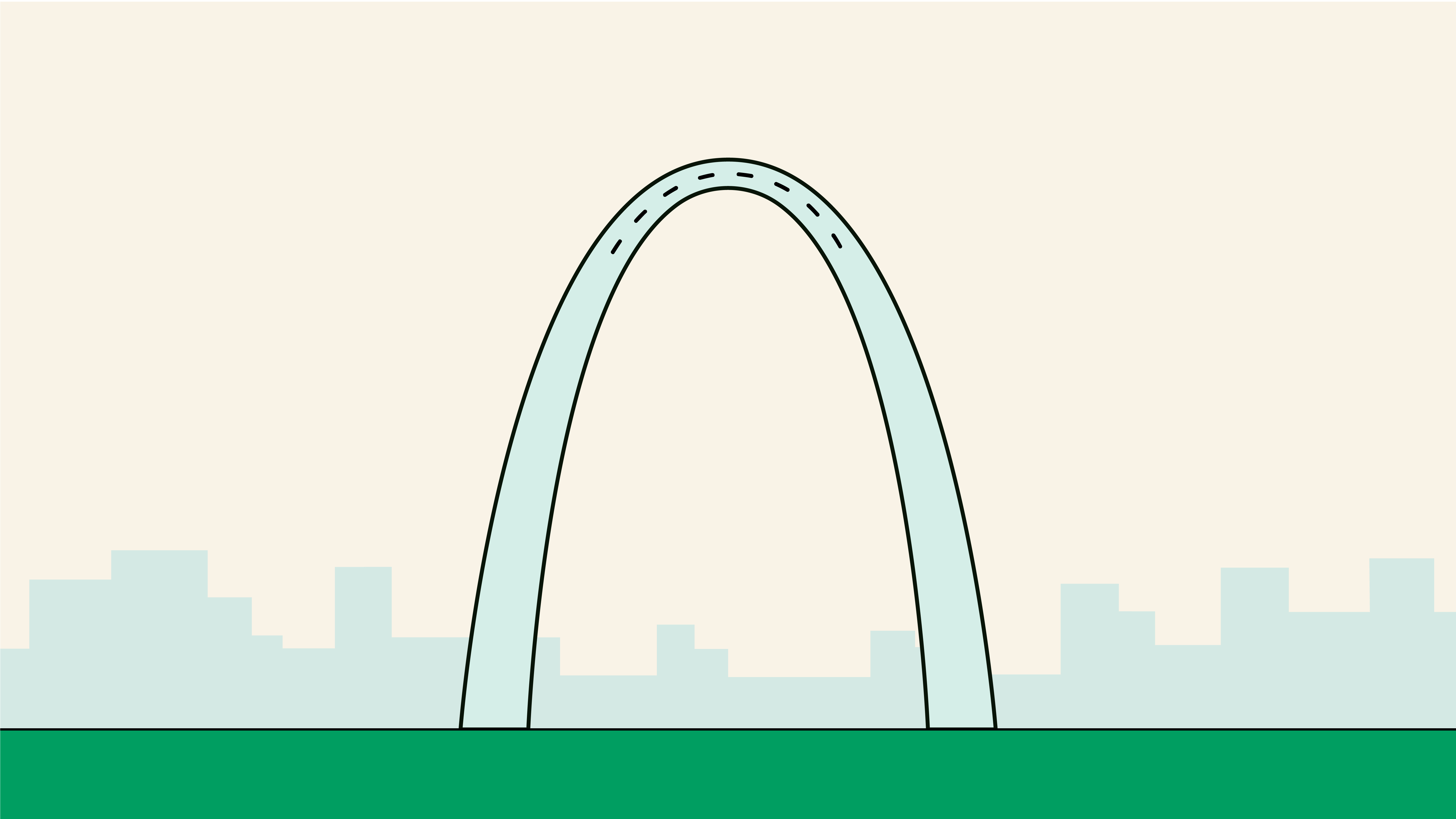
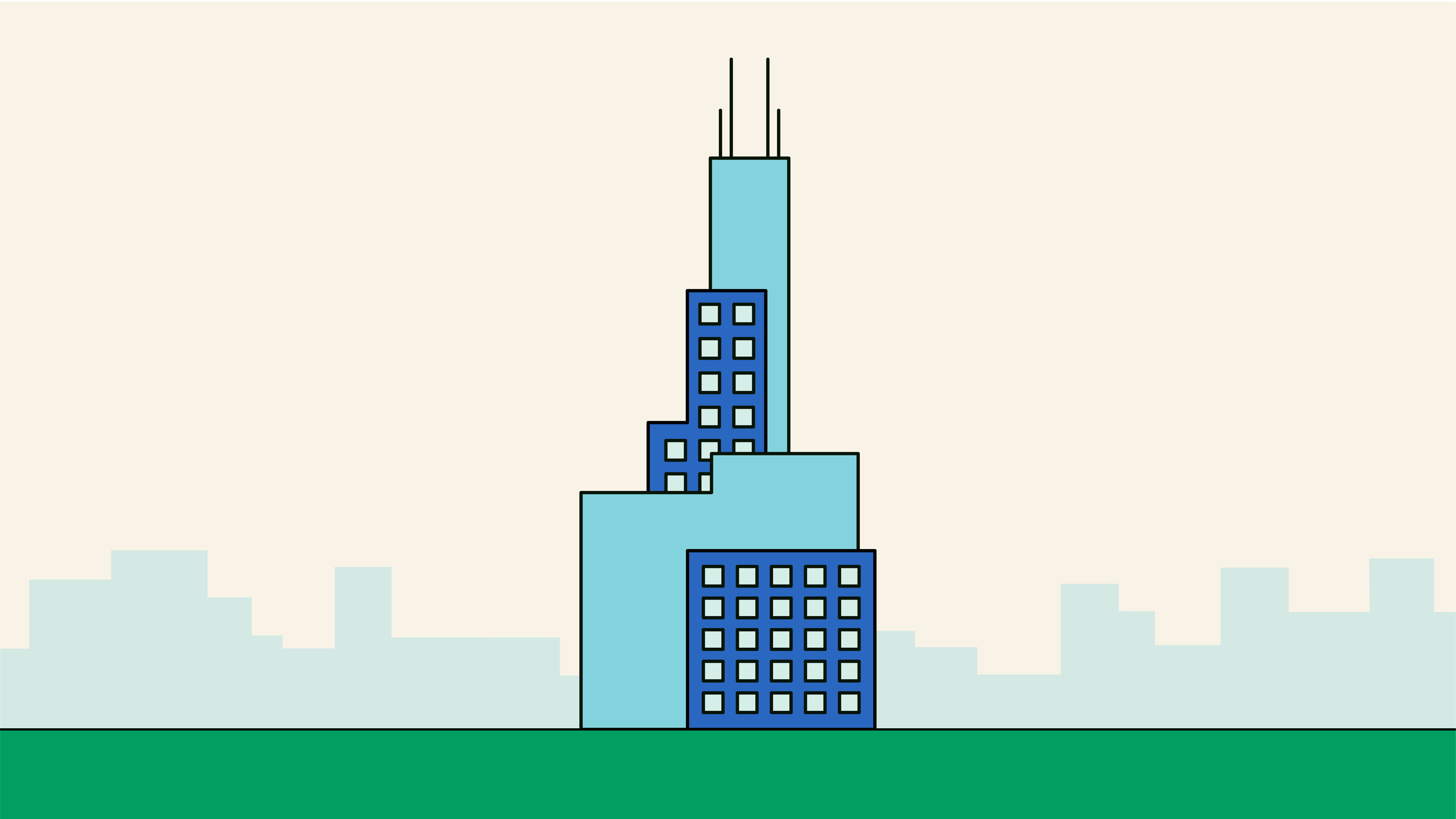
It’s a Balloon! It’s a Burger! It’s Everything, Man
Once we nailed our ultra-simplified balloon and its characteristic shine, we started making balloon animals. Or, rather, balloon things. We knew a digital platform begged for little moments of delight and interactive flourish, so we started defining categories with variations on the logo.
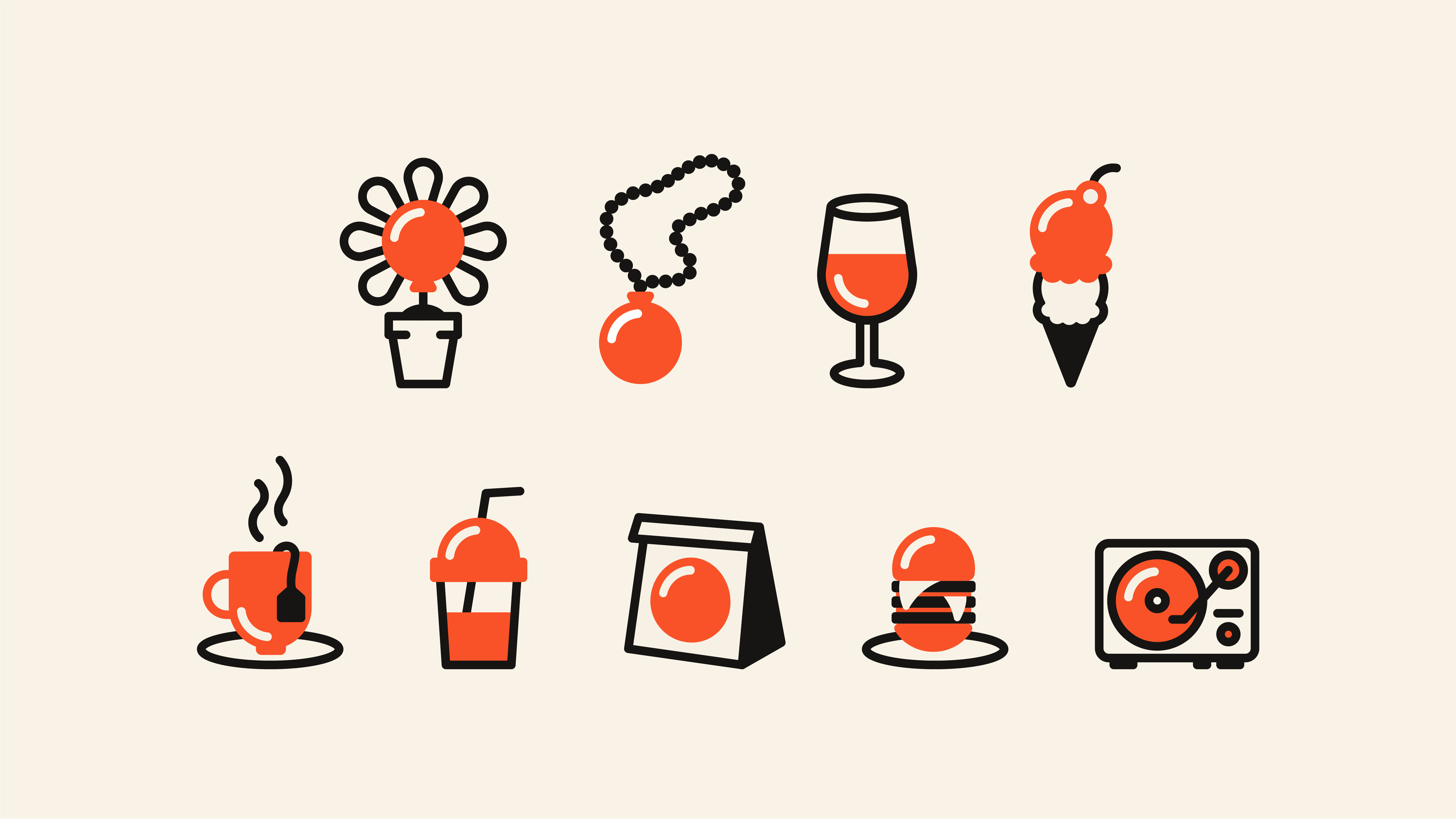
We Can All Float On
We recreated the “aha!” moment of discovering the map pin doubled as a balloon by creating a series of micro-transformations, turning the logo into the full library of category icons.
Keep It Simple, Sweetie
The splash page needed to quickly convey the concept and capture interest from consumers, small business subscribers, and corporate partners alike. The tagline, Give Where You Live, kept it short, sweet, and simple.
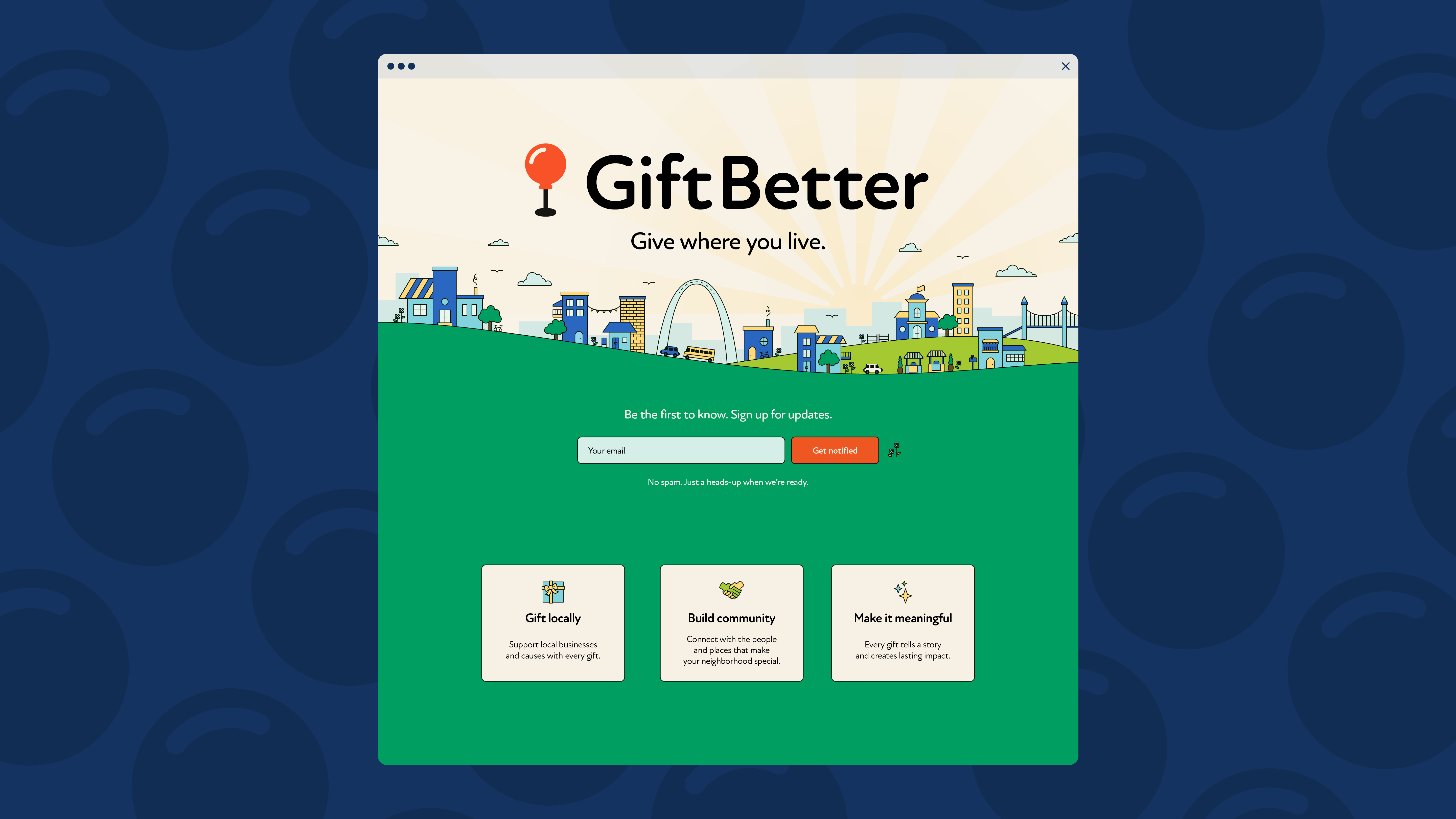
“Pick Me” Energy
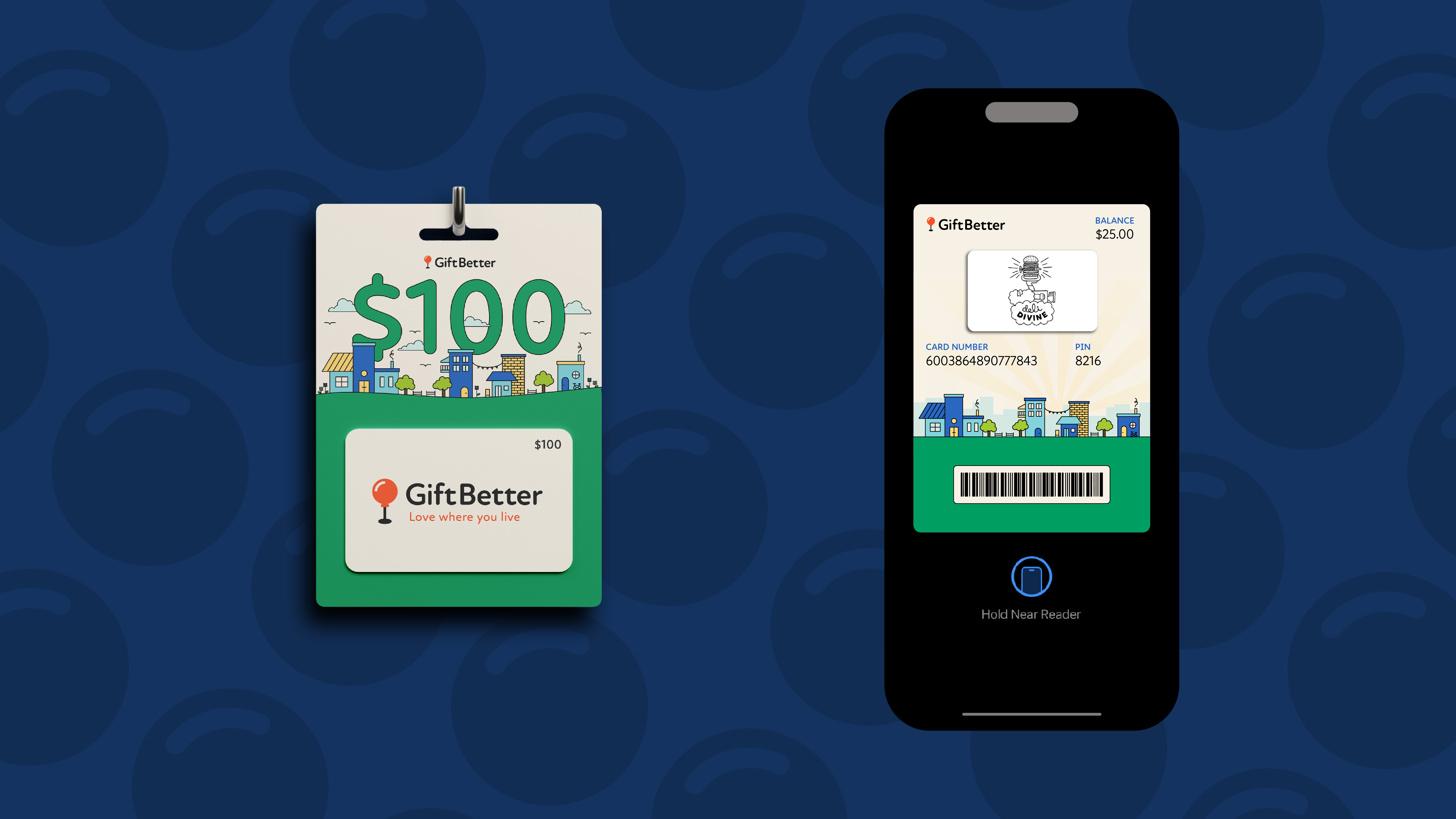
Imagine waiting in line at check-out and facing the Wall of Gift Cards. Maybe it’s end-of-year teacher recognition season. Maybe you need a couple of rewards to distribute to that month’s high performers at the office. Whatever the reason, we wanted our alternative to the standard-issue options to stand out.
So the next time you’re tempted to settle for a Starbucks card, remember:
You can give where you live.
More case studies
South Grand
How we created a brand platform versatile enough for a business district that’s home to both punk bars and baby boutiques.
Swift Lift
How we branded and launched a category-first hunting product using a delicate semi-endangered bird as an (effective) mascot.