

January Moon: Making sensory jewelry suitable for every phase of life
How we helped a new owner transform a former side hustle into a serious DTC and retail contender.
Challenge
Sensory jewelry is generally appreciated for its utility over its aesthetic. How could we elevate perception of the product while expanding the audience beyond kids and babies?
Insight
Sensory jewelry isn’t just useful — it can be beautiful, too. And it has benefits well beyond childhood to soothe anxiety and aid focus.
Solution
Refresh the January Moon brand to retain existing devotees while completely overhauling the website to attract (and withstand!) new fans.
Our client purchased the name, brand assets, and inventory from January Moon’s founder when she was ready to step away from the business. We had a proven product and a small but devoted following, but an e-commerce system that stymied growth and sucked up time. We needed a refresh noticeable enough to signal change and improvement, but subtle enough to keep existing followers in the fold.
As for the website? We had to burn it down and rebuild.
A new moon for January Moon
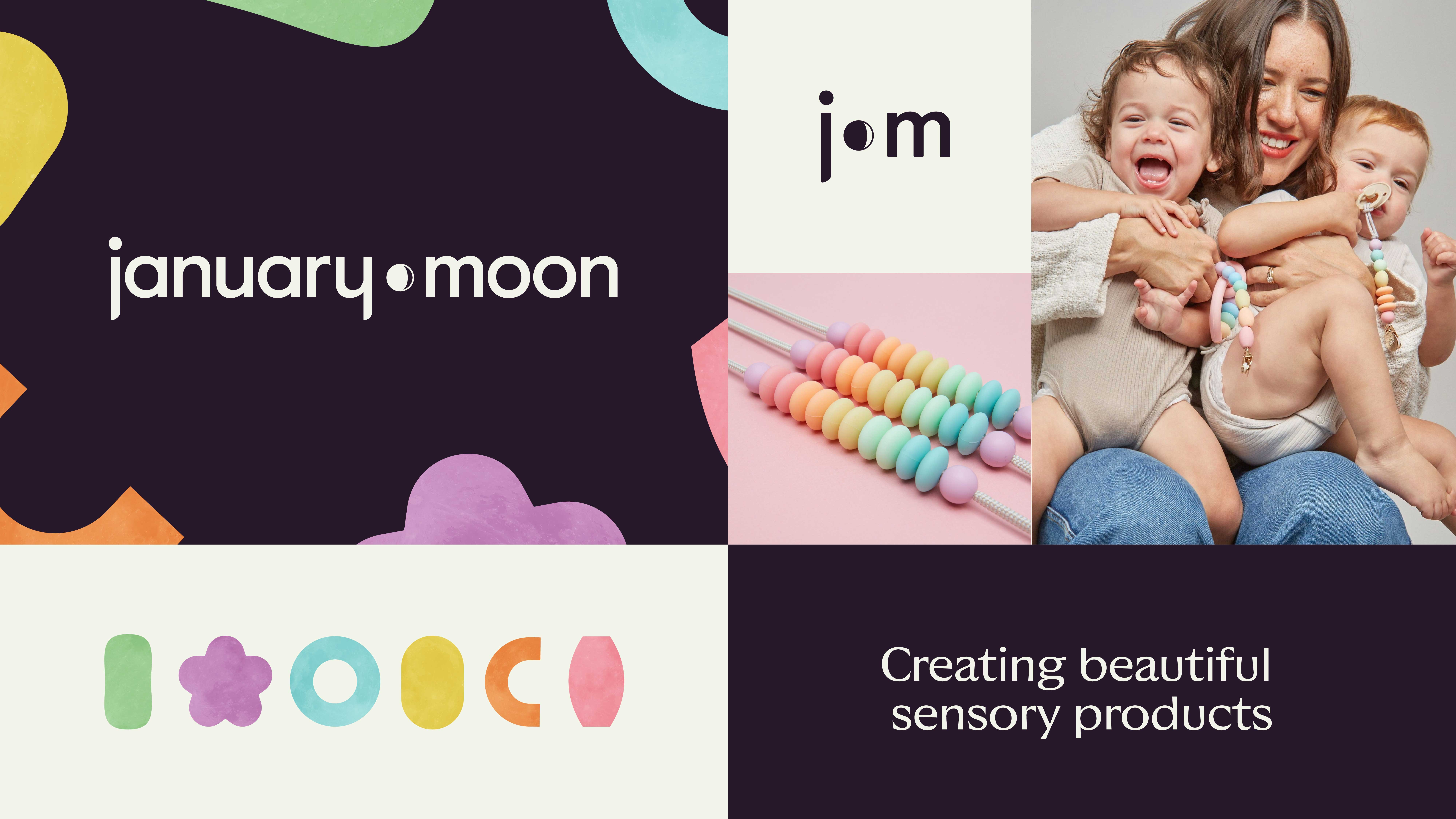
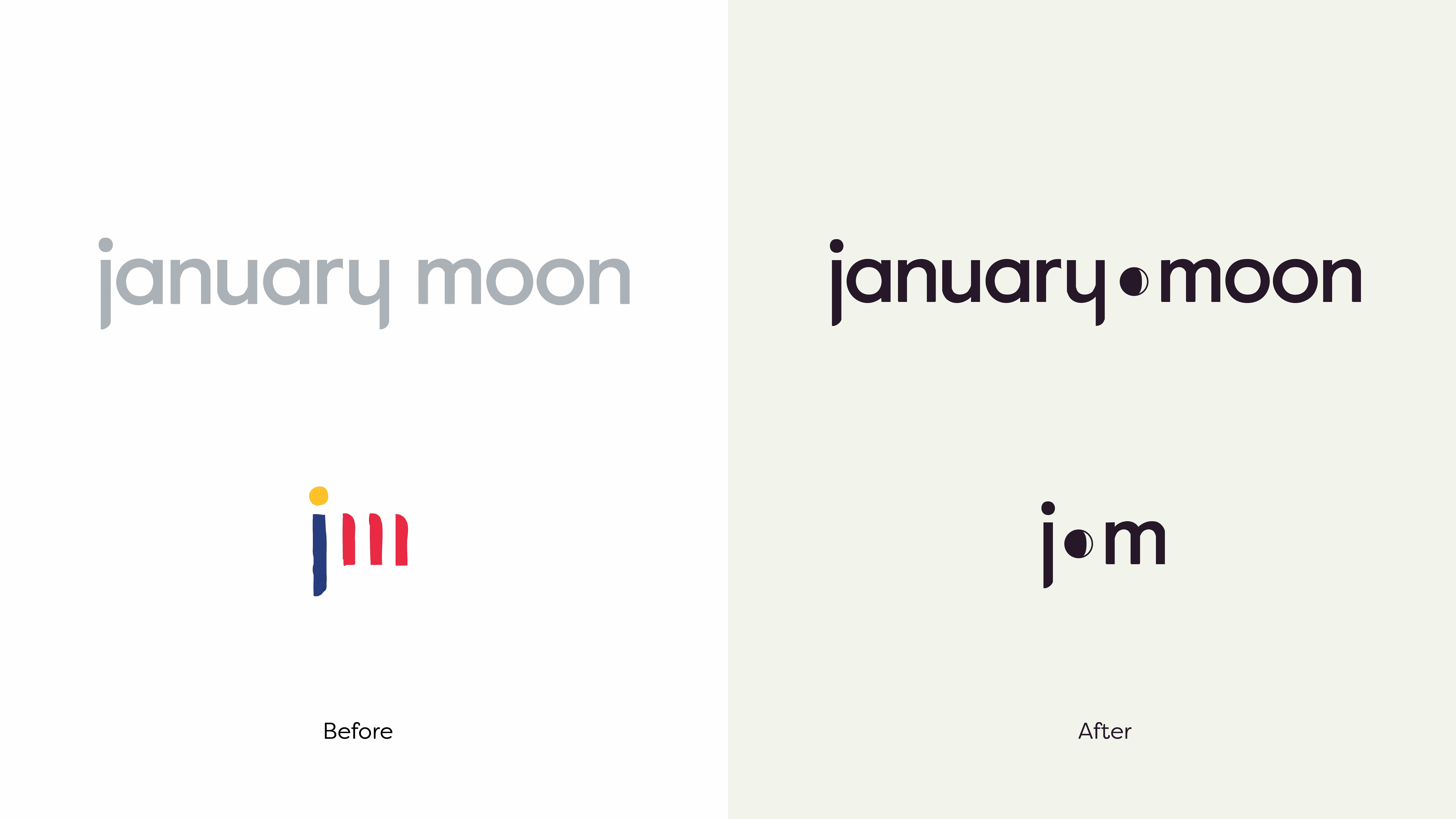
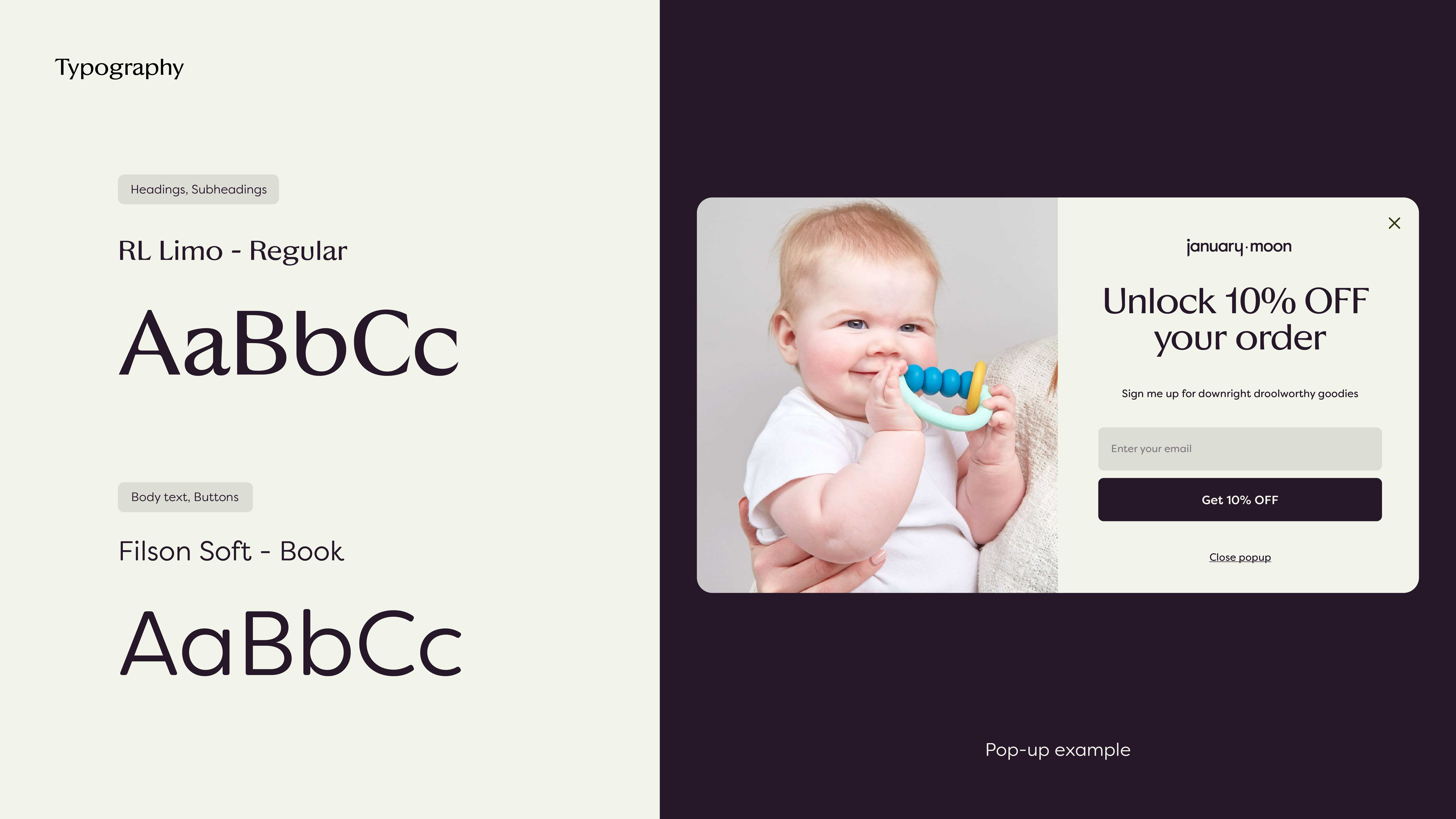
A waxing gibbous moon, to be precise. Our first task was to take an inherited name and maintain meaning for a new owner. With two daughters both born under the same moon phase, the symbol was obvious. Next, we set out to improve the type, create a stronger relationship between the primary mark and the simplified badge, and update the color palette with a moodier, space-inspired feel and celestial textures.

From “making it work” to making money
With sales made through boutique retailers, direct-to-consumer, and wholesale, the existing e-commerce solution was an amalgamation of different platforms and partners ducktaped together on the back-end. It took too much time to make updates and if one piece malfunctioned, the whole system went down.
So while our clients organized SKUs, descriptors and product photography, we integrated systems so that shopping, shipping and customer relationships were (finally) centralized. Lots of testing, custom widgets, and conversations about ideal user flow later, we had the unseen — but critically important — part of the project built.
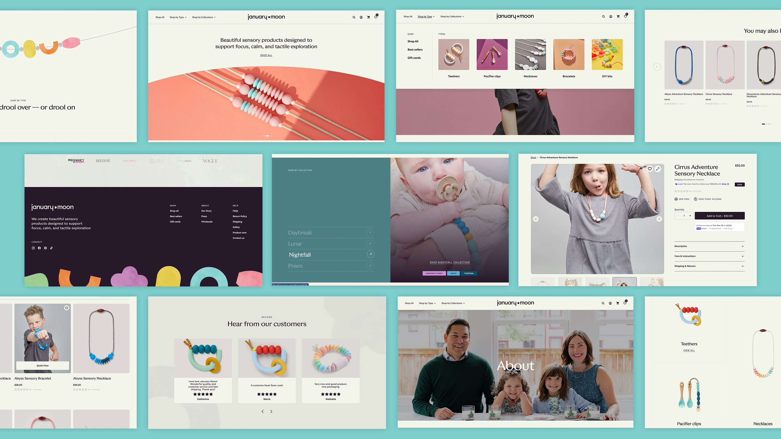
With the invisible infrastructure solidly in place, we were able to turn our attention to designing an airy, engaging shopping experience that invites users deeper into every collection.
Subtle textures and fluid animations give users a sense of the tactile benefits, while new filters emphasize the range of ages who might enjoy the product. With simple updates to the background colors, we were also able to repurpose existing product and lifestyle photography while making it feel totally new.
Visit the site
www.januarymoon.com
Brianna Lum
Owner, January Moon
Results
The same week we launched the new e-commerce site, the product was featured in Architectural Digest and positioned to capitalize on the resulting flood of traffic.
More case studies
South Grand
How we created a brand platform versatile enough for a business district that’s home to both punk bars and baby boutiques.
Swift Lift
How we branded and launched a category-first hunting product using a delicate semi-endangered bird as an (effective) mascot.